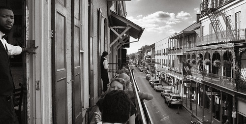
Today I want to demonstrate an element of composition that I like to use once in a while - adding tension to a photograph with an important element near the edge of the frame. Now, it really does add tension, not comfort, so it's not something you want to use all the time, most likely.
Here's what I mean.
New Orleans Balcony #1, by Reed A. George
Panasonic Lumix DMC-LX7
Now, I like the shot above quite a bit. Very strong leading lines everywhere, and the waitress at left is a very nice focal point, somewhere near the edge, but not at it. I like this shot, but don't love it.
Here's another, same place, just a few seconds different timing, with just a little different composition.
New Orleans Balcony #2, by Reed A. George
Panasonic Lumix DMC-LX7
Overall, I'd say this shot is not as nicely composed as the first. The lines converge more centrally to the image, giving a balance that I don't really like. Except. Except for the gentleman standing at the extreme left edge. He throws off that balance completely. His face is a slightly unexpected element in the composition, and I think he adds just that thing to make this picture better than the one above.
I don't think this technique makes for a comfortable, pretty image in most cases. In my opinion, good photographs impart an emotion, not always "oh, that's pretty!" I think the second image does that better than the first.
However, if I were picking one of these to hang on my wall, I'm not sure which I'd pick.
Opinions? Please share.
DMC-365.blogspot.com


No comments:
Post a Comment