Persimmons, by Reed A. George
Leica M4-2, Leica Summaron 3.5cm f3.5 Lens
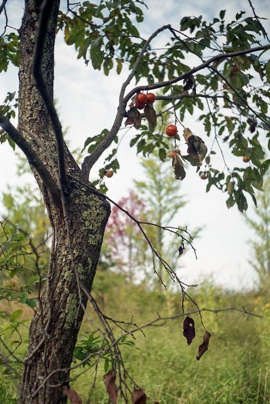
It seems that use of bold colors to make a strong statement is popular these days. It is one of those concepts that you read about in nearly every book about photography and composition. Like the idea of using simple, basic compositions, bold color can really add to the punch of a photograph.
However, sometimes I don't want my photograph to punch the viewer. I prefer something a little more subtle.
Lens choice, lighting type, exposure, and post-processing can all affect how bold or subtle your color is. In the shot above, I used my old LTM Summaron 3.5cm f3.5 lens, which is a master of gentle constrast and subtle colors.
(Click Here) to read an article on digital-photography-school.com about using subtle colors. There are some good example images in that post.
The way you choose to use color and composition says something about you as a photographer. As in regular life, if your style is in-your-face, punchy, bold, that begins to affect your overall reputation, how people think about you. I believe your photographic, artistic reputation is similar in this respect. I would not expect Monet to paint a bold, red, orange, and black abstract. I would also not expect Picasso to paint muted water lilies. It's worth thinking about your own style, rather than blindly following the instructions to make your images punch your viewer. At least not all the time.
DMC-365.blogspot.com
No comments:
Post a Comment